eRetirements

A website expansion guiding couples’ collaboration throughout the retirement relocation process.

01

Initial context

UX Designer // 3 Week Project

At the project kickoff, eRetirements was a website that helped users determine their retirement location. It offered city information and personalized recommendations formed by user self assessments. The founder’s inspiration for the website came from his parents’ unhappiness with their retirement location. They had failed to consider enough factors of day-to-day life beyond the climate and outdoor amenities.

The founder identified a business opportunity to provide retirement resources and recommendations. He wanted to help others avoid making the same mistake as his parents.

After working with a prior Designation UX design team, eRetirements built the self assessment feature to differentiate their MVP. Their goal was to expand the website into a comprehensive guide for retirement relocation. The client challenged my team of three to design a profile dashboard, partner comparison, and retirement roadmap. We needed to integrate these new features with each other and the rest of the website.

02

Discerning the scope

As our second client project, we were already familiar with identifying initial key assumptions. With eRetirements, we had to sift through past UX deliverables, current user behaviors, and proposed concept prototypes. We categorized insights validated by research versus assumptions with insufficient testing. Defining the scope of what we did and didn’t know would help us to determine what we needed to find out.

The potential pool of users starts with the large Baby Boomer population of approximately 76 million people. More than half are already aged 65 or older. An extra 10,000 people per day will continue to retire through at least 2030. Yet, only 55% of Baby Boomers have retirement savings and only 22% are confident that they are doing a good job of saving.

These types of statistics led our client to target users who had already made financial preparations for retirement. Of the Baby Boomers with retirement savings, 58% have $100,000 or more. When they are using financial advisors, 78% have $100,000 or more. Users were considering relocating or buying a second home as they explored recommended cities. Our client defined eRetirement’s current user base as a roughly equal split between two types:

He also defined another possible user existing:

He relayed to us that when he asked users what they would do with their assessment results, most replied, “nothing.” This assumed desire for direction led to his proposed idea of a retirement roadmap.

Along with the roadmap concept, we were also tasked with designing dashboard and comparison features.
The assessment gave users instant gratification, but what would keep them returning?
Assessment
Dashboard
Comparison
  • Past insights:
  • Users appreciated having their assessment results and favorite cities saved
  • Only 2% of current users edited items from the dashboard
  • Client assumption:
  • Users need a customized overview to keep track of all the website’s functions
  • Past insights:
  • Users were eager to view a side-by-side comparison with a partner or other person
  • Married users made up about 80% of current users
  • Client assumption:
  • Users need a way to share the retirement planning process with loved ones
Roadmap
Business Plan
  • Client assumptions:
  • The roadmap meets users’ need for handholding by listing specific steps
  • The roadmap will direct users to all the website’s other content
  • Design team assumption:
  • A universal roadmap goes against the website’s spirit of personalization
  • Past insights:
  • The client wanted users to engage with the website once a week to once a month
  • From a user survey, 43% said they researched locations above the desired frequency
  • Client assumption:
  • Users within a few years of retirement want a planning routine through the website

To wrap up our meeting, we prompted our client to give us an initial hypothesis for eRetirement’s current state:

Our users need a comprehensive and customized resource to know where to retire because it’s a very complicated and personal process.

03

Building on foundations

We conducted ten remote interviews with users at different stages in the retirement process. They were anywhere from ten plus years away to working part-time to already retired. Half planned to retire within a few years or were approaching that window. All were in their 50s or 60s, with a generally even distribution across these two decades. I wrote the interview script for the team to use as a guide. We began with exploratory questions to understand users’ perspectives of their retirement needs. Then we progressed to more focused questions about the proposed features. We needed to find out if users even existed that were in need of detailed directions. If they did, does the roadmap concept address that need?

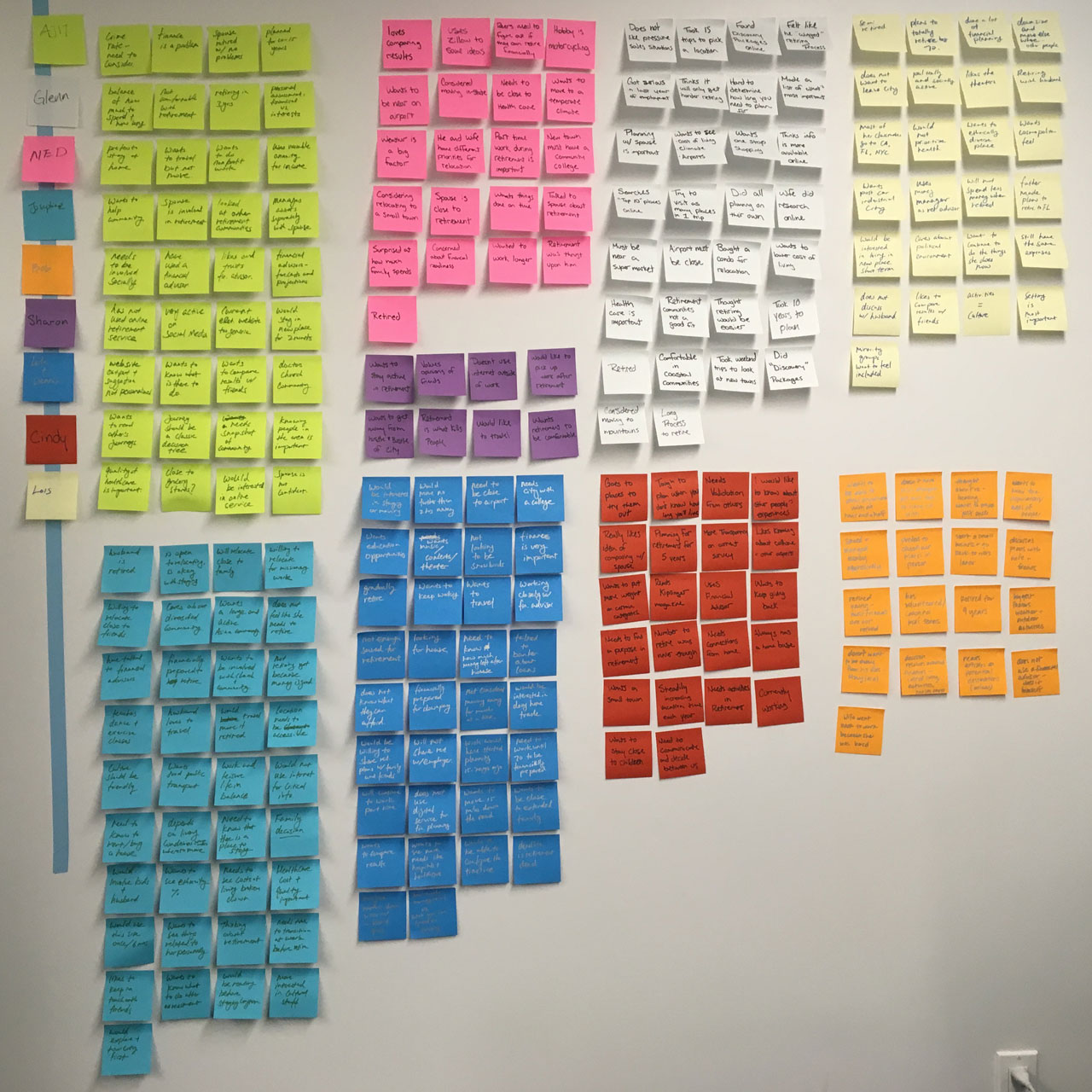
We used a different color post-it for each interviewee to keep track of who said what during affinity diagramming.
“Most of the decision to retire revolves around finances.” - Robert

Money was the most consistent factor we heard across our interviews. It is difficult to predict how long someone will live and how much they will need to have saved for retirement. As a result of this complex component, almost everyone we spoke to used financial advisors. And those that didn’t, possessed career skills to do it themselves. They didn’t want financial advice from eRetirements. Users already met this need on their own.

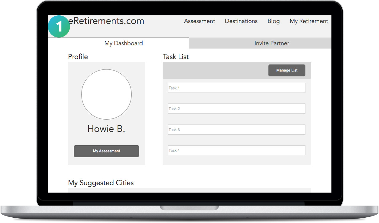
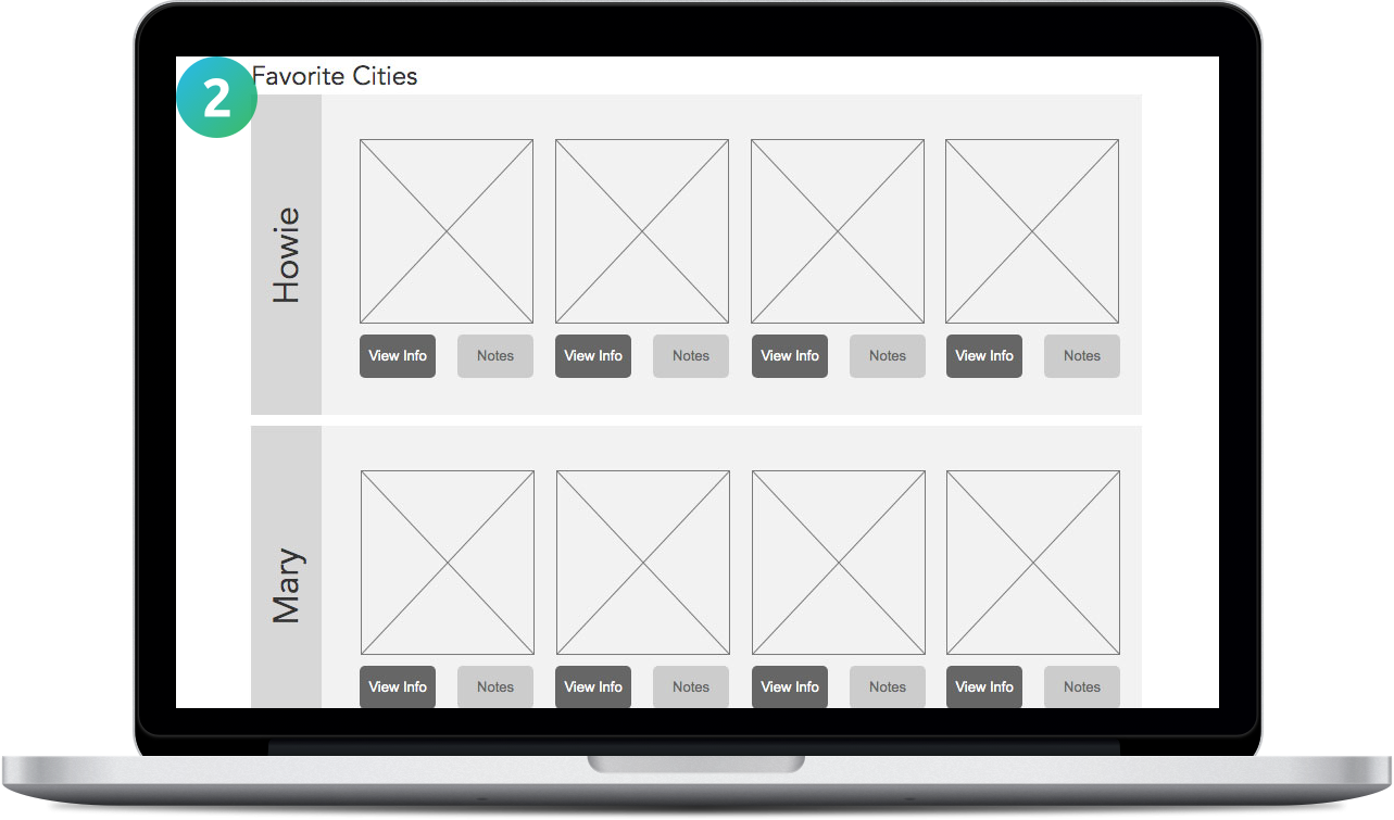
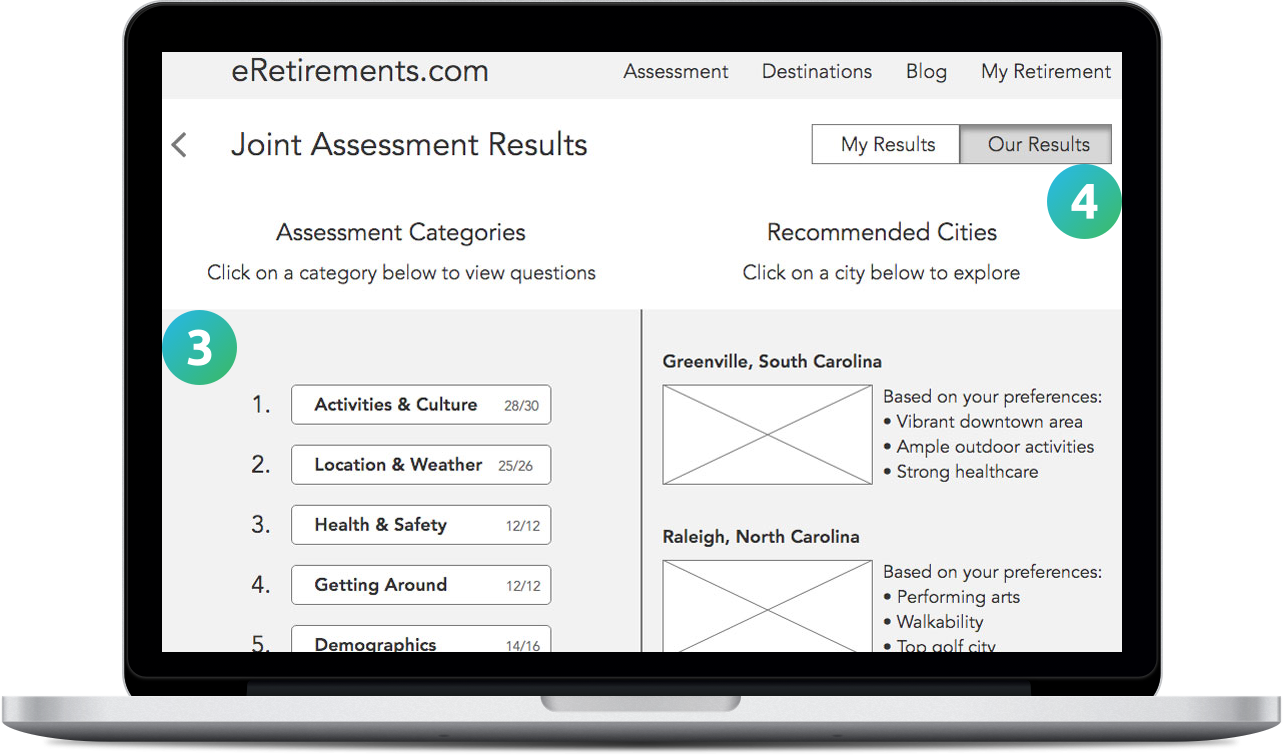
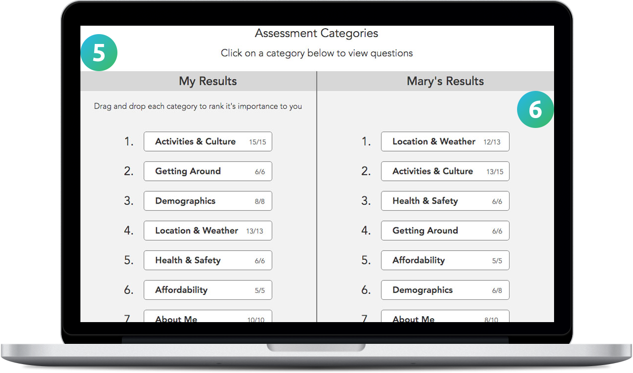
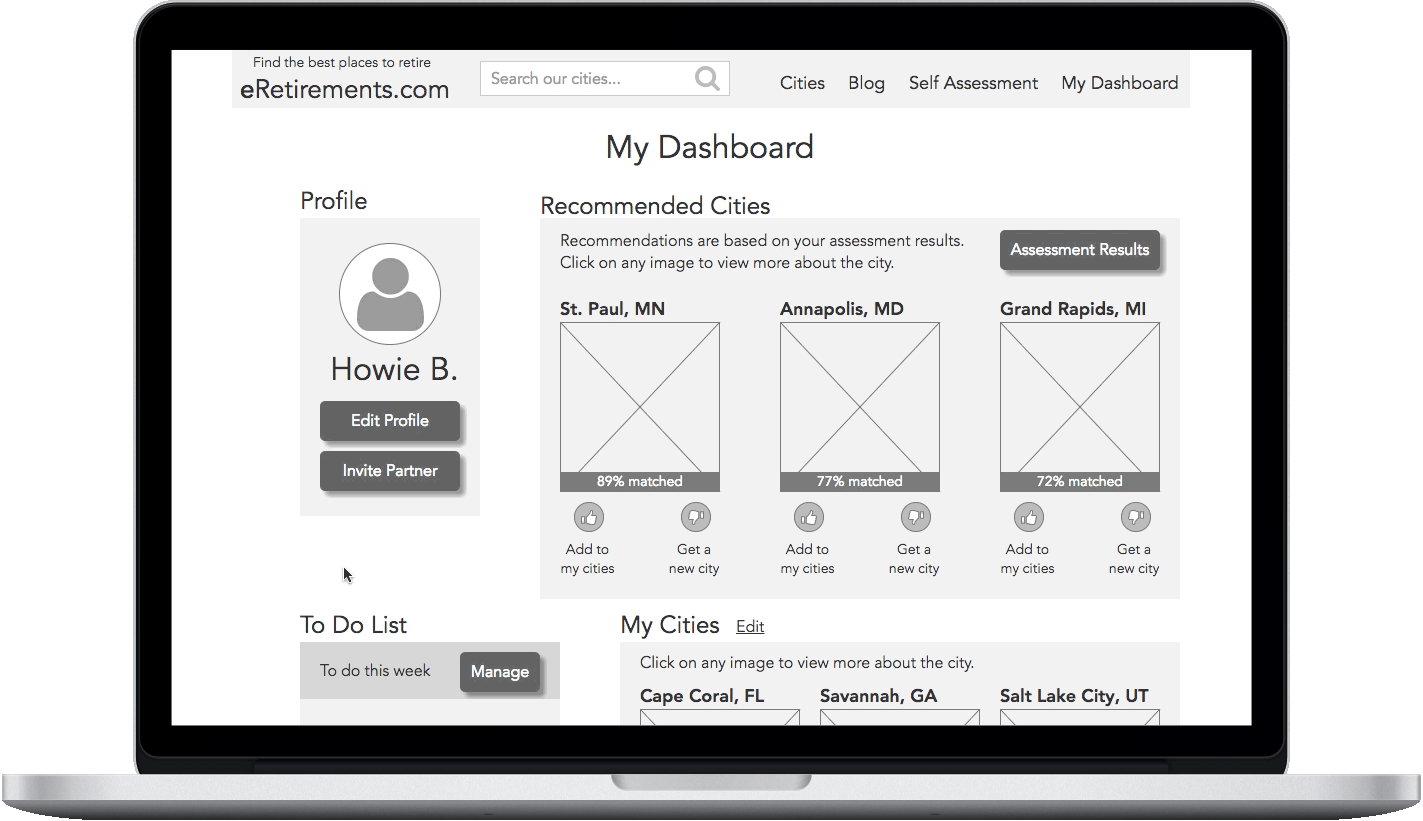
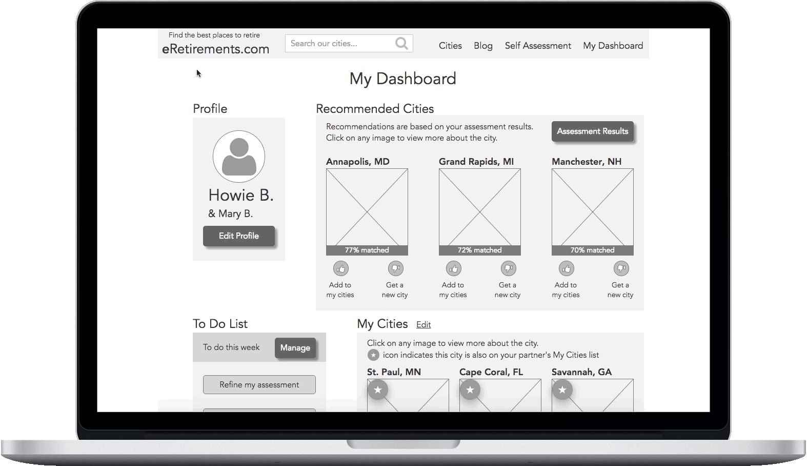
Since six of our users were already familiar with the current website, they gave us unprompted feedback on their assessment experiences. They bolstered the value of the assessment’s custom recommendations. But they wanted to push it even further. Users wanted more control ranking categories or prioritizing answers. They also needed to understand why they received their specific city results. Every interviewee had a spouse they needed to consult with while planning. Some included other loved ones as well. Users needed to communicate their individual preferences to be able to make mutual decisions together.

Assessment
Comparison
“I want to change how I weigh my answers to be able to get a sense of the algorithm.” - Ned
“We discussed it and prioritized a list together. You have to give a little and take a little.” - Glenn

All our users had their own method of planning, with common ideas. They often started more than ten years away from retirement. After assessing financial considerations, users would explore places that might match their personal preferences. Word of mouth from family and friends was a popular form of inspiration. They researched an area’s cost of living and housing prices first. Users wanted to try it out before buying. They needed to visit and demo places, whether that was an extended vacation, part-time living, or renting for a year or two. There is a desire for confirmation before taking the step to move.

Roadmap
“Don’t do anything too abrupt. Take time to ease out of work and add other activities in.” - Cindy

The desire for a continued purpose was our users’ most urgent quality of life concern. Users were adamant about applying themselves. They wanted to stay active, get involved, and give back as much as possible while they were still able. Most users had specifics in mind of what they already enjoyed. They wanted snapshots of the communities from the cultural variety to available activities. Would that location have opportunities for them to keep up with their personal interests?

Personal Community
“Home is where your community is. I want to make a difference in people’s lives over the coming years.” - Ajit
During six of our interviews, we also conducted concept testing of a rough prototype provided by our client (please excuse their typos).
Comparison
Roadmap

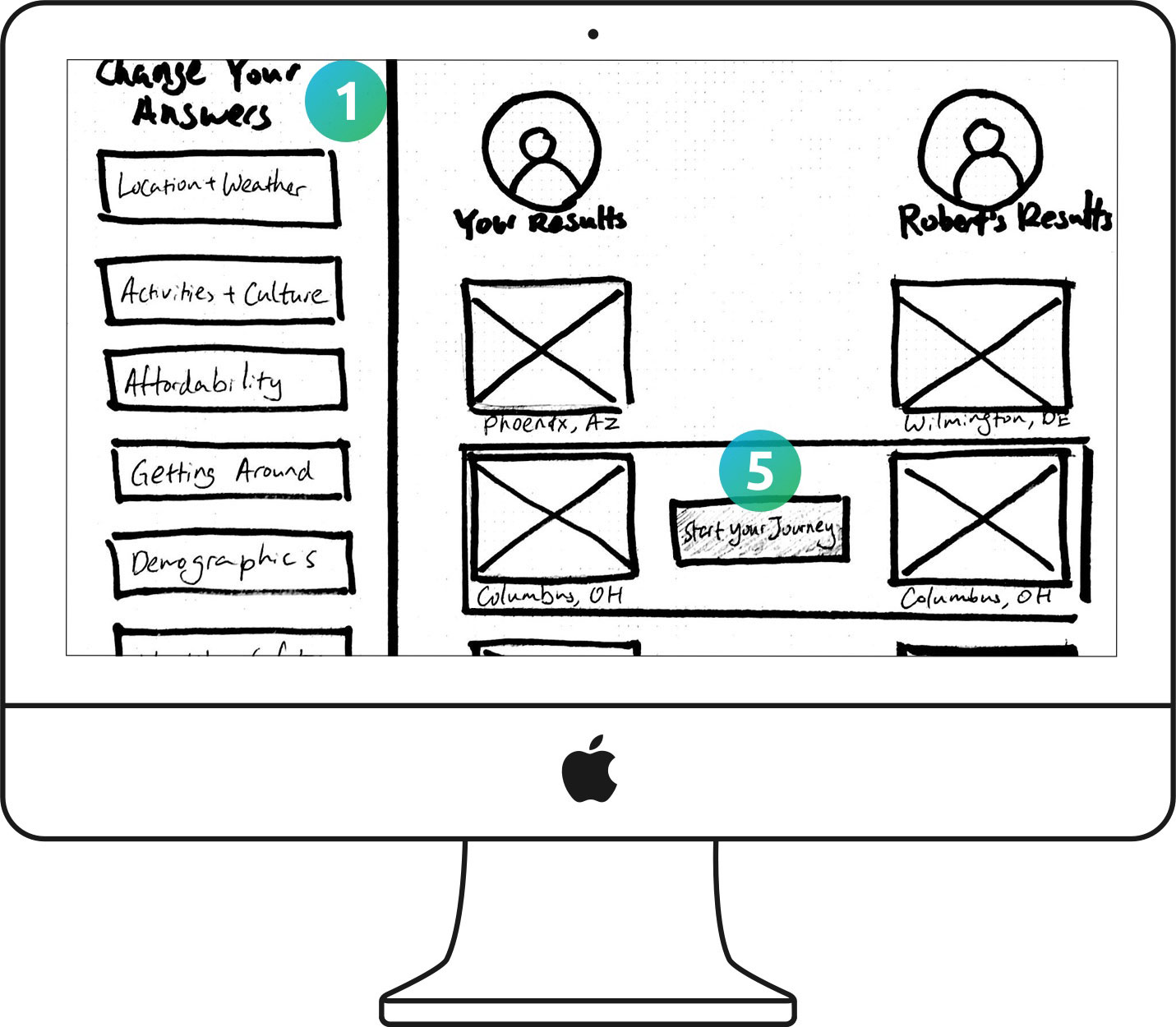
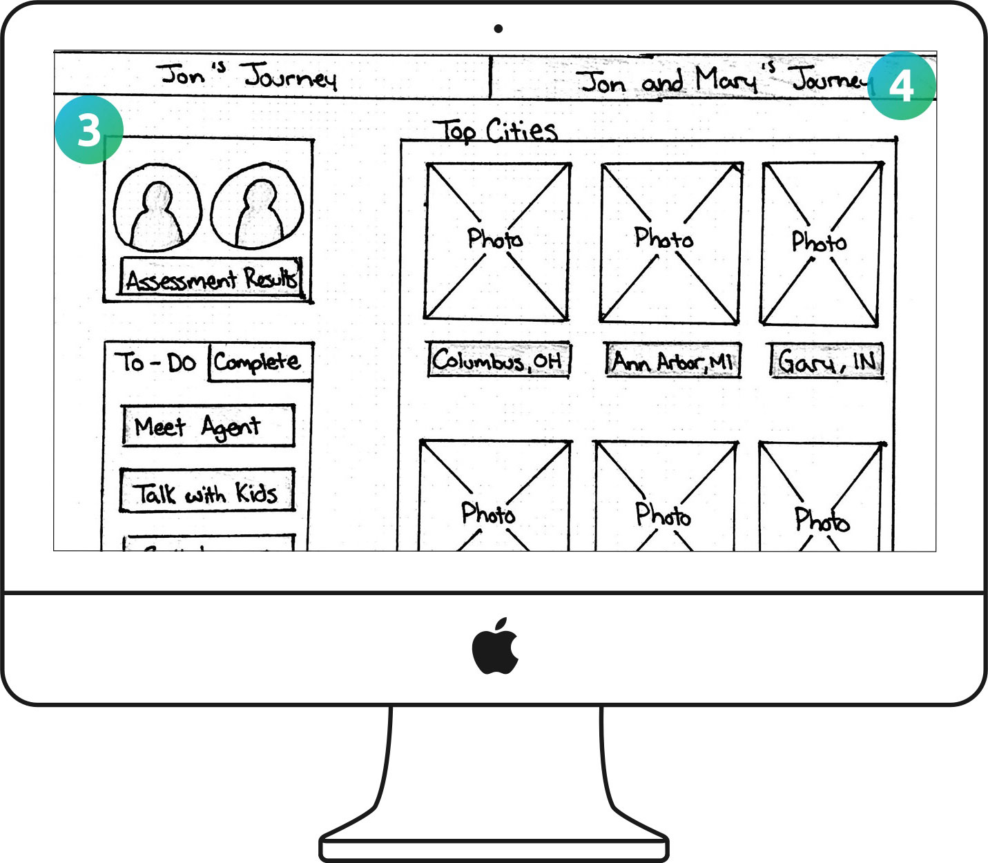
Users loved the idea of comparing assessment results with their spouses. Some people wanted to engage their kids and others wanted to share with friends retiring together. It would stimulate valuable discussion.

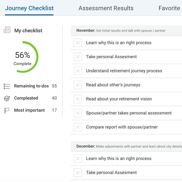
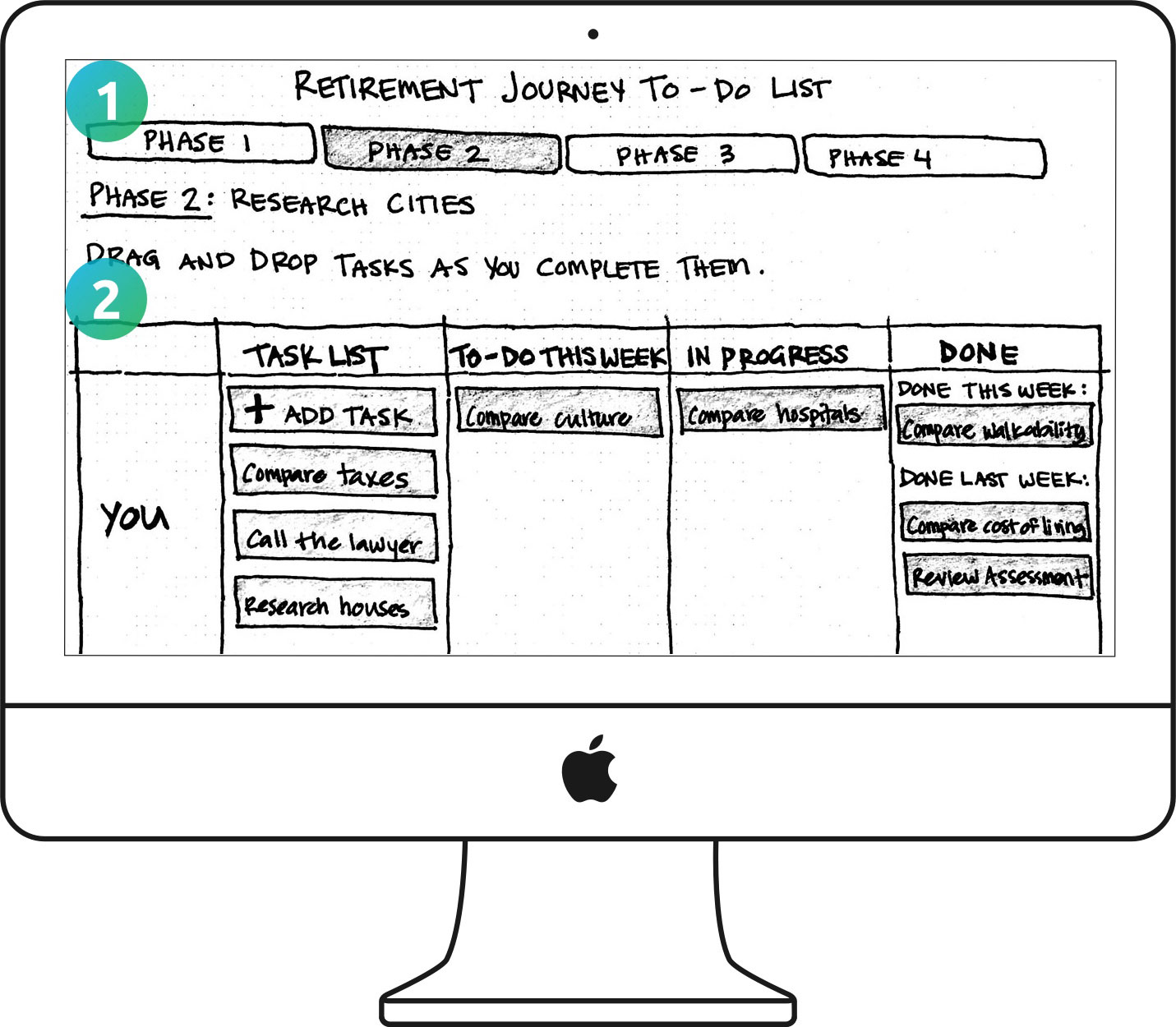
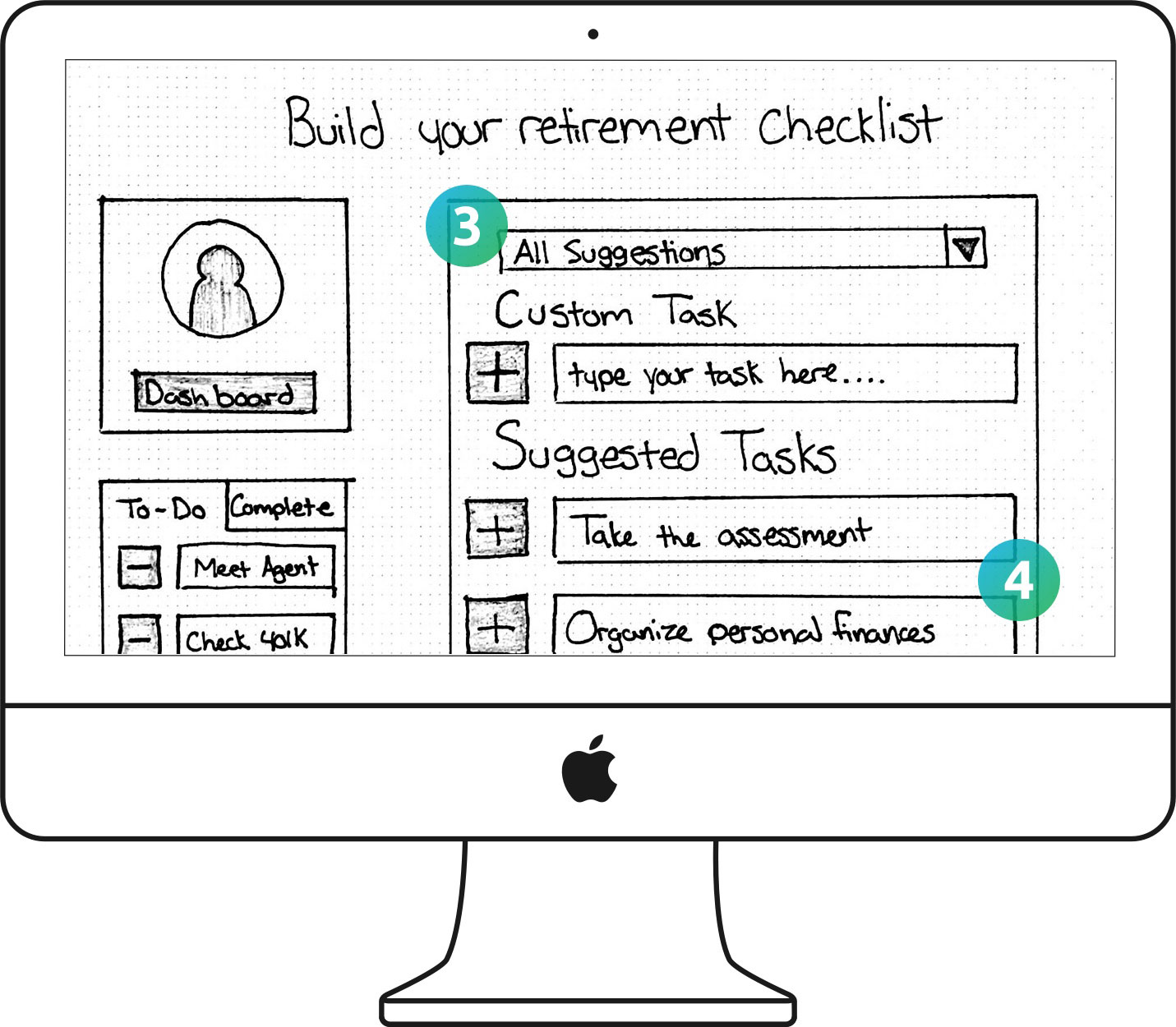
Users felt that the monthly checklist was too generic and ordered. They thought only a few steps might apply to them. Everything wouldn’t fall in a rigid order because the process depends on the individual.

It started to look like the concept of a standard roadmap wouldn’t be specific or flexible enough for our users’ different experiences. But we still wanted to map the common steps we heard about the retirement journey. This helped us to visualize the interplay between factors to consider, tasks to complete, and the passage of time. We identified user needs the current state attempted to address as well as needs the future features would attempt to address.

After whiteboarding, we brainstormed four potential words for phases of the retirement process: prepare, explore, validate, and decide.

04

Adjusting our approach

We found that our client’s initial hypothesis was solid. But after synthesizing our interviews, we updated the problem to be more accurate:

A multitude of considerations contributes to each person’s purpose in their retirement. Retiree couples need a way to balance and discuss their own priorities with those of their partners as they explore and validate their decisions in retirement.

We developed design principles to reinforce insights about our users throughout the project:

  • The proof is in the pudding
  • Live visual updates and explanations exhibit the impact of users’ input.
  • Together we are more
  • Users share and compare with family and friends to open up discussion.
  • Your destiny lies in your hands
  • Users navigate a personalized path of their own creation, rather than a universal one.

With a narrowed direction, we explored precedents to eRetirements’ new features. Task management websites jumpstarted our roadmap brainstorming. We were using a kanban board, KanbanFlow, to organize our internal scrum sprints.

KanbanFlow and Teamweek illustrate the differences between tasks correlated to user capacity versus a calendar timeline.

From these examples, we identified a few takeaways to consider during iterative prototyping and testing:

05

Diverging + validating

With the need for detailed directions still inconclusive, we focused on validating the roadmap through concept testing. I led our brainstorming session by sketching while documenting the discussion. This allowed us to then divide up drawing our paper concepts for efficiency. In total, we tested 15 versions with ten users through three rounds. We experimented with each of the following ways users would gather information:

If none of our broad options resonated with users, we could conclude that they weren’t interested in the roadmap. Yet, if any of our prototypes resonated with users, we could begin to shape the roadmap’s form. Additionally, we got feedback on other features incorporated in our sketches.

These three concepts reinforced assessment and comparison insights while providing new information about the dashboard.
Assessment
Dashboard
Comparison
  1. Users expected to be able to rank the assessment categories based on their priorities.
  2. Users responded to an explanation linking assessment priorities and city results.
  • Users were comfortable with the design pattern of a modular dashboard overview.
  • Users found merged results confusing. How do we incorporate single and joint views?
  • Users loved the side-by-side comparison of cities. Where would it be most impactful?
  • Users needed a breakdown of assessment differences to find ways to compromise.
Feedback varied, but most users were indifferent towards these two concepts depicting word of mouth and documentation.
Roadmap
Personal Community
  1. Users had privacy concerns and felt it was too invasive to reach out to others online.
  2. Users don’t care about others’ processes. They would use more trusted sources first.
  • Users were curious about the cultural experiences that others liked about a city.
  • Users wanted city reviews describing how others found or created their community.
Users loved the task management kanban concept and wanted to use the task checklist to make their own board.
Roadmap
  1. Users wanted the dashboard before the roadmap, otherwise, they felt overwhelmed.
  2. Users liked the phases and partner division to help the process feel more manageable.
  3. Users expected to build their own mixture of custom and common suggested tasks.
  4. Users proposed task details with guidance on how to complete the provided tasks.
Business Plan
“This is better than using pieces of paper. I could use this once a week.” - Leila
“This is cool. It’s like my financial planner giving me a list of tasks to do.” - Dennis

06

Converging + restructuring

We confirmed the need for the roadmap and had a direction for its form. Next, we built an interactive prototype in Axure. We created versions of features for A/B testing to determine users’ preferences. Through concept testing, we learned it was important to not give too much information at once. The dashboard became the key touchpoint in consolidating access points to existing and new features.

We conducted remote usability testing of our prototypes. While on speakerphone, we shared a computer screen and relinquished mouse control to users.
The most successful comparison feature was within the assessment results, not the dashboard.
Dashboard
Assessment
Comparison
  1. Users preferred to have cities more prominent than tasks with all units above the fold.
  2. Even when side-by-side instead of merged, users still didn’t like a joint dashboard view.
  • When reranking categories, users wanted to select an update button to be in control.
  • Users questioned merged results since they wouldn’t be able to know who said what.
  • Users preferred the assessment’s side-by-side, which would help them to compromise.
  • Users didn’t want to edit their partner’s side and needed it to appear inactive.
Users enjoyed the assessment’s drag and drop of categories, while they felt that the results provided a lot of useful information.

After numbering our roadmap’s phases in paper prototypes, we named the phases in our digital prototype. We used our brainstormed journey map terms of prepare, explore, validate, and decide. Testing exposed the word validate as objectionable. We responded by conducting a card sort with ten users through Optimal Workshop. Taking 27 suggested retirement tasks provided by our client, users grouped the tasks and named their groups.

Using majority consensus of terminology, we created three new phases: preparation, research/decision, and action. Users then described these updated words as straightforward.
Phase tabs at the top and partners in the left column divided the “snowboarding” version.
Phases in the left column divided the “skiing” version for each partner’s separate board.

One user compared the two layouts to the differences between snowboarding and skiing. Snowboarding has a more difficult learning curve but is easier to master. Users were slow to notice the phases at the top. But with a fuller board, the tabs would keep the page consolidated. Skiing is easier immediately but is harder to master. Users were quick to understand how everything related and liked moving tasks between phases. But with heavier use, the page length would create the need for lots of scrolling.

After weighing the pros and cons, we chose the skiing version for initial ease of use. Users appreciated starting with an empty slate. They preferred building their own roadmap using the add task pop up, where suggested tasks lived in a drop-down. Users liked their partner’s board hidden from view at first, so it wouldn’t influence their thoughts. Again, users didn’t want to edit their partner’s side.

Users impressed us with the speed at which they mastered the roadmap’s interactions, especially the drag and drop.
Roadmap
“Add a task and boom there it is.” - Leila
“This gives good suggestions, but it’s also freeform, which is excellent.” - Susan

07

Moving forward

During our final client meeting, we handed off our deliverables and gave recommendations for the future of eRetirements. Building on insights from testing, these ideas are the next logical steps. But we did not test the degree of detail that worked for users.

Assessment

To further increase personalization, users could rank the assessment’s individual questions within categories. Coinciding with this could be a side-by-side comparison of partners’ answers. The assessment could also include extra questions to determine the users’ position in the process. They could receive a custom roadmap starting point and adjusted suggested tasks.

Roadmap

To further integrate the roadmap, suggested tasks could link to the content that already exists on the website, such as city pages or blog posts. This could improve access to resources throughout the website. Suggested tasks details could also consist of guidance on how to complete these tasks.

Personal Community

To further increase personalization, users could create custom cities and contribute to city pages. Users familiar with the current website reported that they liked the incorporation of more cities and more detail on city pages. From concept testing, users wanted to learn about others’ experiences of activities and their communities, such as through reviews or photo blogs.

08

Final reflection

If we had more time, I would have taken better advantage of the prior UX design team’s research. We applied their insights, but we could have examined their dashboard and comparison prototypes’ depth of detail. Although testing a lot of concepts helped us to find our solution, we could have tested more developed concepts, informed by their designs. I learned to be mindful of assumptions based on user demographics. We applied a tech solution that was outside the box for our audience’s problem. We didn’t dismiss it before testing because of our users’ assumed tech-savviness.

While working within a smaller part of an existing website, it was important to sort validated insights from assumptions. Specifying this distinction was an expansion of my design process. We then categorized assumptions with insufficient testing into those belonging to our client or the design team. This was essential to communications with our client, so we stayed on the same page during the project. To read more about my design process evolution, check out my previous projects, Ven.u and Simple Slice.